What makes a great video game UI design
Great video game UI design lets players stay inside the world rather than wrestling with menus. The best interfaces are built around the game's mechanics and tone, not bolted on at the end.

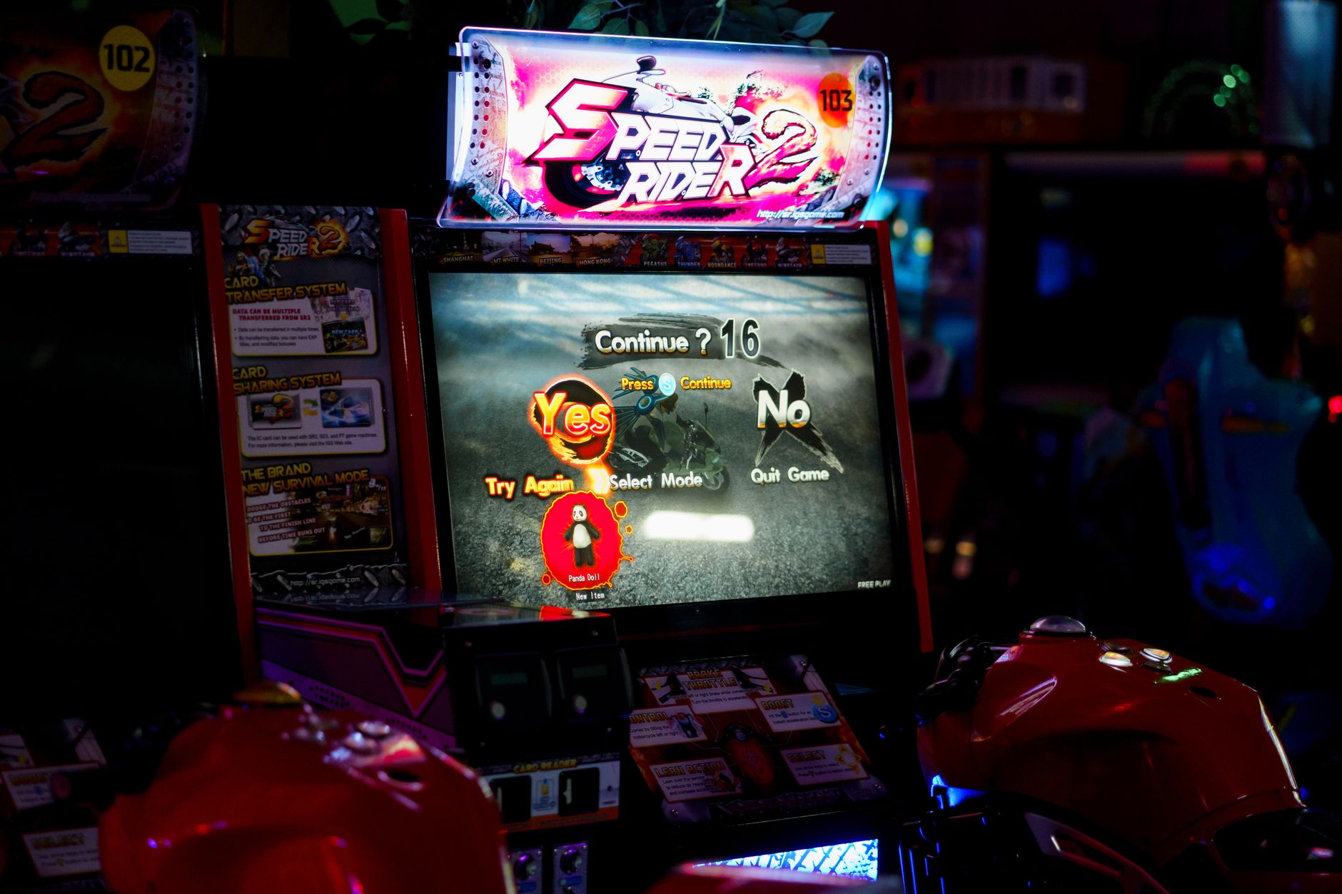
Photo by cottonbro studio on Pexels
Video game UI design is one of those craft areas that only gets noticed when something goes wrong. When a health bar clips the action, when an inventory screen requires five button presses to open, when a tutorial tooltip blocks the enemy you need to see, the interface stops being invisible. Good UI design removes itself from the player's path. The best examples go further: they become part of the experience itself.
The difference between HUD and menu design
Most games split their interface into two distinct zones. The heads-up display (HUD) sits on screen during play, showing health, ammo, minimap, or whatever the game considers essential at a glance. Menus govern everything outside real-time play: inventory, settings, skill trees, load screens. Each zone has different demands, and confusing the principles behind them is one of the most common mistakes in game UI development.
HUD design is primarily about cognitive load. Players are already tracking movement, enemies, and timing. Every extra element on screen competes for attention. The original Metal Gear Solid solved this by tying its radar display to an in-world codec device, giving the surveillance information narrative plausibility. Dead Space went further, eliminating the HUD entirely and embedding health into the player character's spine. Both choices served the game's tone precisely.
Menu design has different problems. Players arrive in menus when they want to do something specific: equip a weapon, adjust difficulty, check a map. The interface needs to answer that intent fast, without requiring memorisation of where everything lives. Menus that bury settings inside sub-menus, or that use icons without labels, force players to learn the interface rather than the game.
Diegetic versus non-diegetic UI
Designers use the term diegetic to describe UI elements that exist inside the game's world. A watch on a character's wrist showing mission time is diegetic. A floating timer in the corner is not. Neither approach is superior, but choosing between them without thinking about tone is where many games go wrong.
Immersive sims and survival games benefit most from diegetic UI because their whole proposition is convincing the player they're inhabiting a place. A radio broadcasting objectives, a notebook the player physically opens, a fuel gauge on an in-world vehicle: these pull players deeper. Action games and strategy titles generally can't afford the friction of diegetic systems. When a player needs information in half a second, putting it on a character's phone they have to hold up is a design mistake, not an artistic choice.
The skill is knowing which elements can be diegetic and which need to sit outside the fiction. Most successful games mix both, deciding element by element rather than committing ideologically to one approach. A game's art style should inform which approach fits: a grounded military shooter and a cartoon platformer need fundamentally different answers.
Readability at speed
UI designers talk about "readability at a glance," meaning the player should extract information in under a second without moving their eyes far from the action. This is harder than it sounds. Most games are played on televisions from 2-3 metres away, or on handheld screens in variable lighting. What looks clean on a monitor at a design desk can become unreadable on a large screen across a room.
Colour contrast is the first lever. Red health bars on dark backgrounds work because the contrast is high and the meaning is culturally learned. Problems start when designers use low-contrast pastels for readability, or when multiple UI elements use the same hue to mean different things. Accessibility standards from film and web design apply directly here: a minimum contrast ratio of 4.5:1 between text and background is a practical floor, not a target.
Typography matters more than most game developers treat it. Small, decorative fonts that look great in a concept document become illegible during play. Bold, simple typefaces with generous letter-spacing hold up at resolution. The games with the cleanest UI typography tend to use no more than 2 typefaces across the entire interface, one for headers and one for body information, kept consistent at every screen.
Feedback and responsiveness
Interface elements need to respond to player input in ways that feel immediate, even when the underlying system takes a moment to process. Button presses should produce visual and audio feedback within 100 milliseconds, or the interaction feels broken. This is why good UI design is inseparable from sound design: a menu click, an inventory swap, a map pan all need audio confirmation to feel real.
Feedback also means confirming that an action succeeded. Equipping a weapon should change something visible. Saving a game should show a save indicator that clears only after the save completes, not one that disappears while the data is still writing. These details seem small but they're the difference between players trusting the interface and players developing anxiety about whether anything they do is actually registering.
The best game UIs also fail gracefully. When a player tries something impossible, the feedback should explain why, not just refuse. Greyed-out options with a brief tooltip explaining the prerequisite take 30 seconds to design and save hours of player frustration. Good tutorial design and good UI design overlap here: both are about communicating rules without making the player feel stupid for not knowing them.
Consistency across screens
A UI that behaves one way on the inventory screen and differently on the map screen creates cognitive friction every time the player switches context. Consistent button mapping, consistent visual language, consistent interaction patterns: these are the foundations of a UI that players stop thinking about. When the same button confirms a selection everywhere, and the same button cancels everywhere, navigation becomes automatic.
This sounds obvious. It's violated constantly. Games built on large teams across long development cycles accumulate UI inconsistencies the way old codebases accumulate technical debt. A settings screen designed in year one of development looks and behaves differently from a crafting menu added in year three, and players feel the seam even when they can't name it.
Establishing a UI pattern library early, and enforcing it, is a production discipline as much as a design one. The games with the most coherent interfaces tend to have a single designer or a small team with authority over the whole system, rather than UI decisions distributed across feature teams who each solve the same problems differently.
Context-sensitive UI
The most sophisticated game interfaces show only what's relevant at any moment. Near a vendor, a trade prompt appears. In combat, the minimap expands. During cutscenes, the HUD collapses. This context-sensitivity reduces clutter without removing information: the UI presents the right tools at the right time rather than displaying everything always.
Implementing context-sensitive UI requires knowing the game's states precisely and designing for every transition between them. It's technically demanding and easy to get wrong at the edges. But the payoff is a screen that never feels cluttered, because the interface is always sized to the current task. Combined with thoughtful open world design, where the player's state changes constantly, a responsive UI is what keeps the screen from becoming noise.
The principle behind all of it is the same: the interface serves the player, not the other way around. Every screen, every tooltip, every icon exists to give players faster access to what they're trying to do. When the UI disappears into the background of a session, that's when it's working.